
Interim “Entourage”/Context:
From showing my work so far at the interim viewing in class I got a lot of helpful feed back.
The main points of my work which were commented about was:
- Colour – My example i showed was very very colourful for the data i was representing, I was recommended to try a more sombre colour scheme as the one I had chosen (to see the different countries) looked like =the olympic rings colour scheme which made it out that i was portraying a happy feeling to the sombre toned data input I have chosen (Suicide rates of men and women per Country)
- Positioning – Some critics my work had was that it wasn’t very clear where the low and high parts of my work were, being all triangles it dont show the extremity my data was showing which means its represented badly. I was suggested to try make a single point so it creates a centre point which everything comes out of so its easier to see which country have extreme outlier data inputs.
- More info/detail – A main point was what my input represented because a lot of people weren’t sure and I hadn’t made it clear as it just looked like a lot of overlaid colourful triangles. This was because I had planned to add text but it wasn’t shown in the interim (due to still working on the code). My plan was to add text to show what my data was actually about and how i would use the design generated to bring awareness to the sensitive topic. Text like either the actual statistic number/ percentage or the country name so you can differentiate who’s, who’s.
In context Examples of my work:
I chose a wide variety of print related in context example to put my work on.
The overall design changes on the different mediums to adjust to the specific size and elements of the context examples. The data I chose to represent for these examples was both male and female 2015 Suicide Rates of 10 First World countries.
<EDIT> (This design has been further developed form week 9 but I shall explain in week 11)
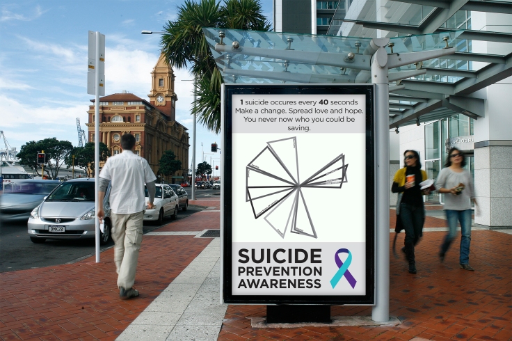
Bus Station Poster Advert:
For this example, I felt that the larger format would emphasis the theme of my data, Suicide Prevention Awareness. The combination of the design from the input and text shows the elements quiet clearly. I also added a quote which links to the design.
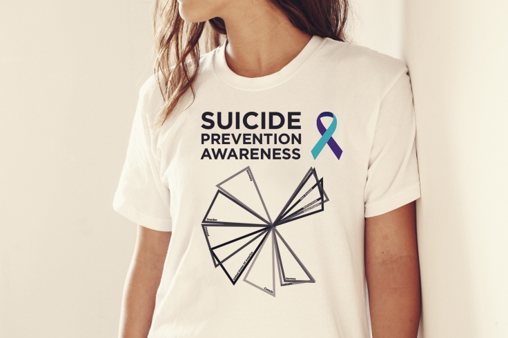
Female T-Shirt:
For the female T-shirt, I knew that if I were to really put a design on a t-shirt i would be stuck to a rectangular shape as it would have to be printed on, so for this example I compacted the over idea down to the main text and the image. Keeping them both reasonably big, (for hierarchy purposes) so it was easy to read and easy to grab your attention, which is important as it is been made to bring awareness. I feel the warmer tone of this in context example is giving quite the opposite emotion I want to portray when using Suicide data as my data input.
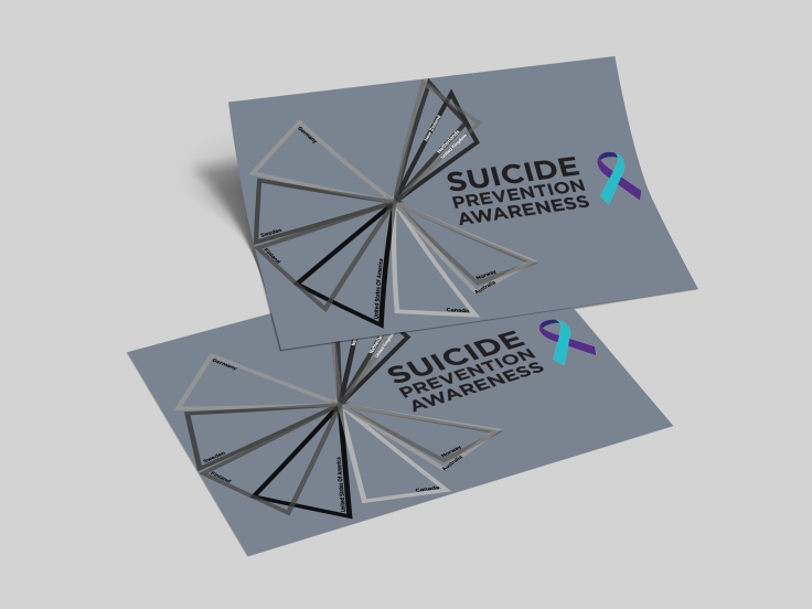
A5 Flyer:
Being a smaller sized medium, I again focused on the core elements such as the design and text again. But this time I made sure that the design took up most of the space as the shape of it fitted well over half the page. I tried to use a dark dull colour for the background to go with the sombre tones of the data but i think it takes away from the design itself so in the future I’ll most likely use a more suited colour so nothing is lost or portrays the wrong emotion about the data.
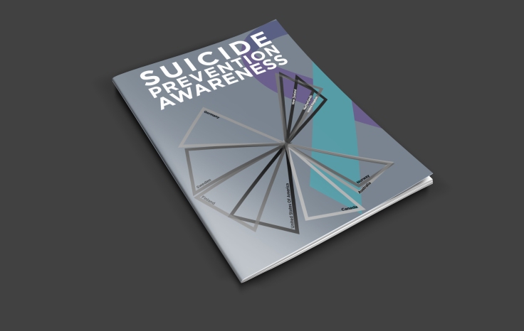
Magazine Cover:
Another idea i had when thinking about my print out put was to make a magazine with my data, for this in context example I attempted to create a Magazine Cover with my the design formed form my data. Like the flyer I feel like the background colour doesn’t work too well but the text stands out a lot more as it is white. I tried to incorporate the Suicide Prevention Awareness Ribbon in a different way and i feel that it is also lost with the background colour and that is takes your eye away from the actual design for the data.
Male T-shirt:
For this in context example I tried to see a male t-shirt example would be like.

Underground/Subway Wall Poster:
I chose a different sort of poster for this example. This is because due to trying to bring awareness the data input I would display the posters in a heavily populated public area.


Leave a comment